Charts Are Breaking Down All Over.
They say a picture is
worth a 1,000 words, so here are 4,000 words worth. The good people at www.stockcharts.com put together this
series of charts establishing beyond any reasonable doubt that the “RISK ON”
trade is breaking down across all asset classes.
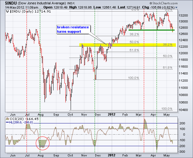
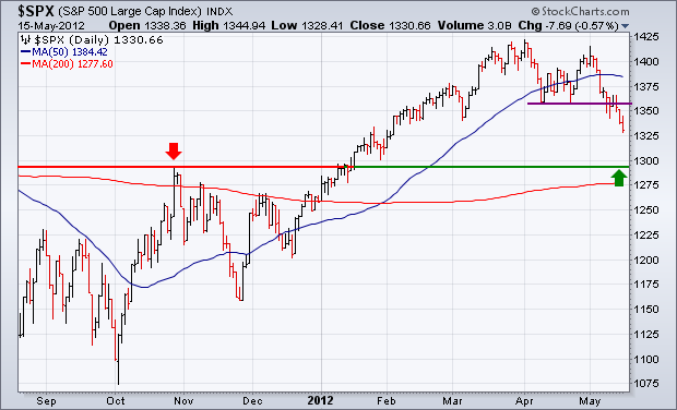
Everything is breaking
down, simultaneously and in unison, including the S&P 500 (SPX), Gold
(GLD), Silver (SLV), Oil (USO), Copper (CU), the Euro (FXE), the Australian
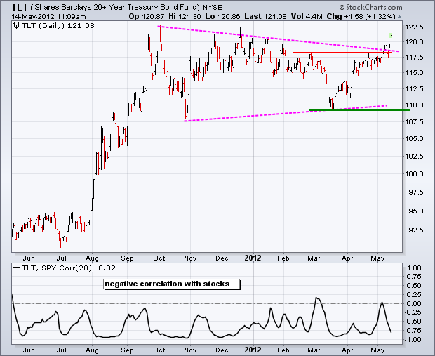
dollar (FXA), and the Canadian dollar (FXC). In the meantime, Treasury bonds
(TLT), (TBT) are moving from strength to strength.
The news from Europe can
only get worse. An American recession, considered impossible by strategists
only a month ago, is now looming large as their economic data continues to
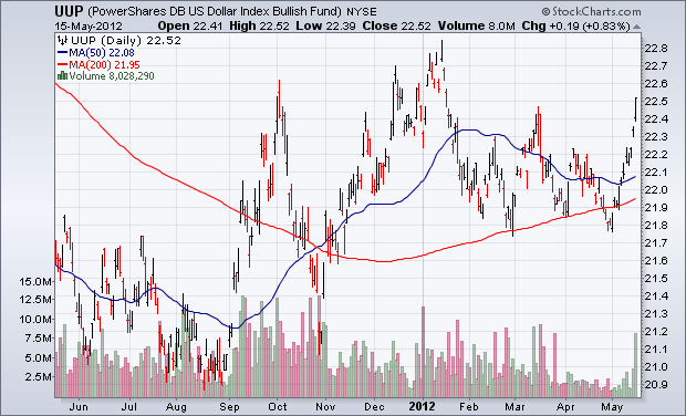
deteriorate. The flight to safety has exploded into a stampede, driving the US
dollar index up 12 consecutive days, a new record.
If these charts continue
to break down, as the news flow dictates they should, here are some downside targets which could be met pretty rapidly:
(SPX) 1,280
($INDU) 12,200
(IWM) $70
(FXE) $126
(FXA) $95
(GLD) $150
(SLV) $25
(USO) $32
(CU) $22
No comments:
Post a Comment